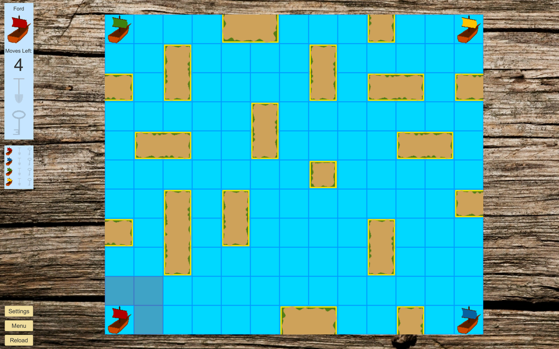
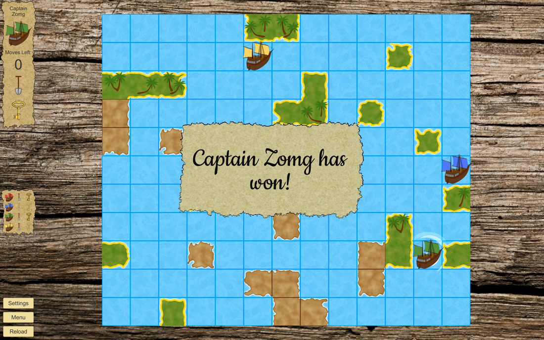
First off, some news on the Key, Shovel Treasure front. I've set up a draft for the itch.io page for KST. The text certainly needs another editing pass, but the look is pretty much where I want it to be:
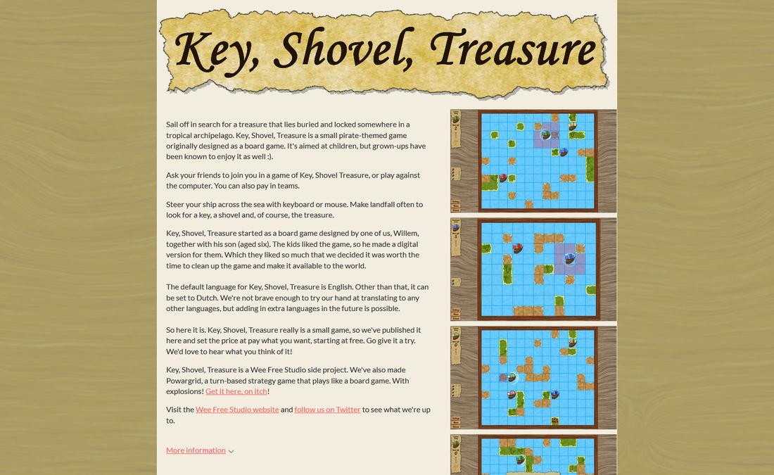
I first tried a monocolour background, but that was too bland. After some trial and error, I added the KST background, but then a lighter version with much less contrast. The screenshots may need replacing, since there still are one or two more things I'd like to change.
Then the marketing front. As I wrote last week, I'm not really comfortable with that. I think that asking people for attention is annoying if done often. The 'problem' is that for me, too often is not too different from almost never. Which doesn't help. And this goes even for a medium like Twitter, which is much less intrusive than an email (in my opinion).
There are some things I've grown more comfortable with by now, such as posting a link to our blog or to the Powargrid Steam page. And then I still think that doing so twice a day is being rather active and doing so four times in a single day is pushing it. Best if I never try to make a career switch to social media guru :P. As an aside, Michiel has about the same outlook in this regard.
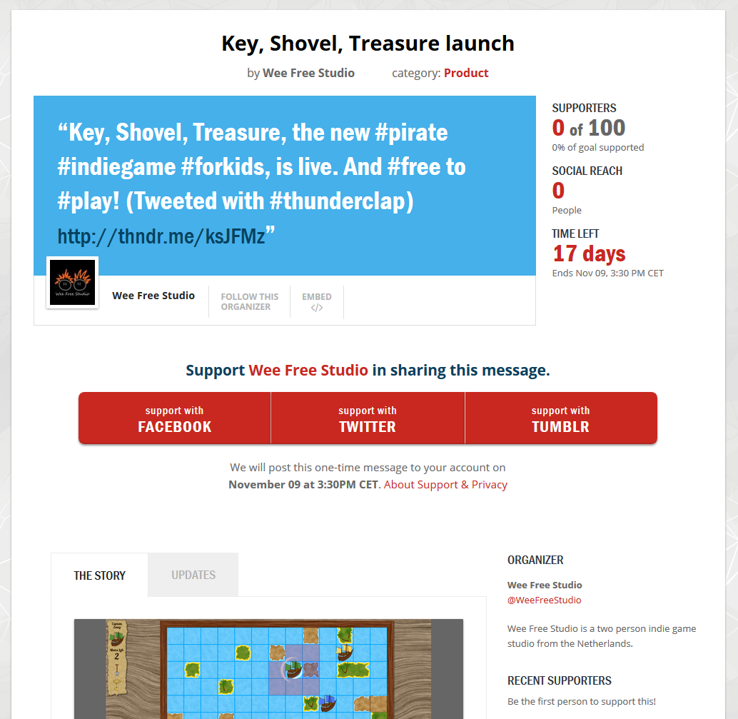
All that is mostly a preamble to our Thunderclap. We currently have three supporters out of 100, two of which are Michiel and myself. That's not a great score in one week, to say the least. I think that a large part of that is that asking people to support our campaign feels too much like bothering people (to me at least). Which means that I'm not active enough by far in trying to recruit supporters.
We've considered spamming our friends and family to ask them to join, but that means the message would mainly be spread in the network closest to us. Also it'd feel like bothering people. Do I sound like a broken record yet? So for now, we'll let the Thunderclap rest. We won't discontinue the campaign, but it's unlikely that we'll be pursuing it very actively any more.
Which is sort of fine. For me, Key, Shovel, Treasure is for a large part about experimenting and doing new things. Something that didn't work is a datapoint too :).
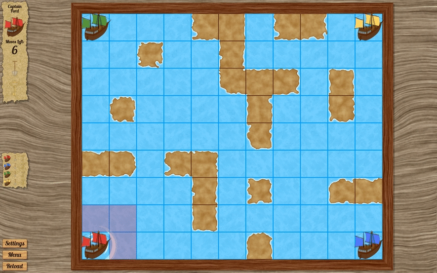
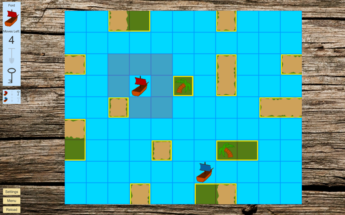
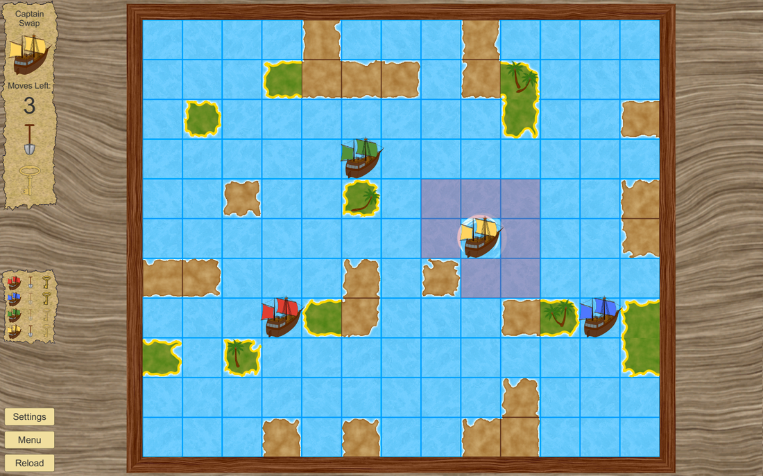
On a more cheerful note, here's a new KST gameplay gif:
Then the marketing front. As I wrote last week, I'm not really comfortable with that. I think that asking people for attention is annoying if done often. The 'problem' is that for me, too often is not too different from almost never. Which doesn't help. And this goes even for a medium like Twitter, which is much less intrusive than an email (in my opinion).
There are some things I've grown more comfortable with by now, such as posting a link to our blog or to the Powargrid Steam page. And then I still think that doing so twice a day is being rather active and doing so four times in a single day is pushing it. Best if I never try to make a career switch to social media guru :P. As an aside, Michiel has about the same outlook in this regard.
All that is mostly a preamble to our Thunderclap. We currently have three supporters out of 100, two of which are Michiel and myself. That's not a great score in one week, to say the least. I think that a large part of that is that asking people to support our campaign feels too much like bothering people (to me at least). Which means that I'm not active enough by far in trying to recruit supporters.
We've considered spamming our friends and family to ask them to join, but that means the message would mainly be spread in the network closest to us. Also it'd feel like bothering people. Do I sound like a broken record yet? So for now, we'll let the Thunderclap rest. We won't discontinue the campaign, but it's unlikely that we'll be pursuing it very actively any more.
Which is sort of fine. For me, Key, Shovel, Treasure is for a large part about experimenting and doing new things. Something that didn't work is a datapoint too :).
On a more cheerful note, here's a new KST gameplay gif:
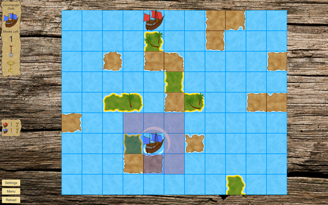
And then for something completely different: space colonies! This (obviously) has nothing to do with Key, Shovel, Treasure. But next to that we've been working on some other things we haven't shared with you yet. One of those things has to do with space (SPAAAACE!) and will have colonized planets. Michiel asked me to give some thought to generating background stories for the colonies.
Which sounded like a cool challenge to me, quite compatible with my current skill level in coding :). So I spent a long weekend fiddling around with ideas and writing scripts and I actually managed to produce something that generates backstories for planets. It's nowhere near finished, but it does enough to show it here. In my opinion that is ;). Here's an example of a background story as it's generated now:
Which sounded like a cool challenge to me, quite compatible with my current skill level in coding :). So I spent a long weekend fiddling around with ideas and writing scripts and I actually managed to produce something that generates backstories for planets. It's nowhere near finished, but it does enough to show it here. In my opinion that is ;). Here's an example of a background story as it's generated now:
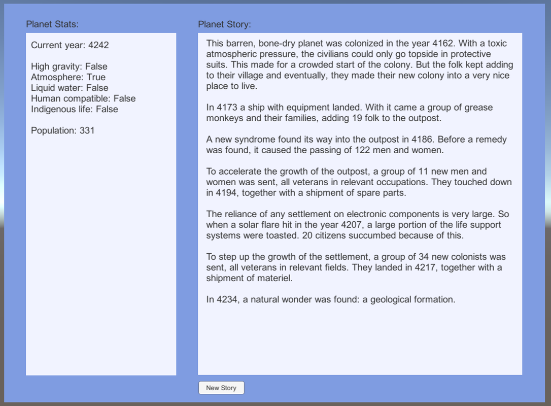
Please don't take too much note of the UI design here. This is no more than a testing scene for the story editor. Michiel has been prototyping some real cool stuff for the future UI, which he'll write about in a future blog post.
In order to generate stories that differ quite a lot, I implemented three main features. First off, I separated the potential planets into five different types:
While other types of planets or combinations of these are certainly possible, this mostly covers the angles I would like to use for the background stories. Also, five basic planet types isn't so much that there's an explosion of combinations each of which needs its own story considerations. So with these types, things should stay rather manageable.
Secondly, I created a text file for each of the planet types with a couple of colony start stories, one per line. When a story is generated, I pick a line at random and use that as the opening. I also created the same sort of text files for events that can occur in the colony, from new immigrants to a comet strike to the discovery of a natural wonder. Whenever an event takes place, a line is once again picked at random from the correct file and added to the story.
At the moment, there are only a few options per text file. This means that some story elements are quite repetitive right now. But I think that once I have about seven or eight options per file and once more event types are added, this repetitiveness should be mostly gone.
And third, I added synonym markers and variables to the text files. Whenever a word or group of words is placed between these <brackets>, the story parser will choose a synonym for that word at random from a csv-file. I'm not yet convinced that this is a scalable way to work, but for now it's quite an effective way to bring a bit more variation to the stories.
Everything I put between [square brackets] is a variable and will be replaced by the corresponding variable for the planet for the moment the story element refers to. For now, I only use this for the year and the population. But I built it in such a way that adding (a lot) more variables should be no problem.
Here are some more examples of stories this process can generate:
In order to generate stories that differ quite a lot, I implemented three main features. First off, I separated the potential planets into five different types:
- No atmosphere.
- An atmosphere, but no liquid water.
- Liquid water, but a surface that's hazardous to humans.
- A surface that's quite benign to humans, so you can walk outside with only light protection (a small breathing apparatus and a thin protective coverall instead of a full spacesuit), but devoid of indigenous life.
- Indigenous life forms (of the multi-cellular lush ecosystems variety).
While other types of planets or combinations of these are certainly possible, this mostly covers the angles I would like to use for the background stories. Also, five basic planet types isn't so much that there's an explosion of combinations each of which needs its own story considerations. So with these types, things should stay rather manageable.
Secondly, I created a text file for each of the planet types with a couple of colony start stories, one per line. When a story is generated, I pick a line at random and use that as the opening. I also created the same sort of text files for events that can occur in the colony, from new immigrants to a comet strike to the discovery of a natural wonder. Whenever an event takes place, a line is once again picked at random from the correct file and added to the story.
At the moment, there are only a few options per text file. This means that some story elements are quite repetitive right now. But I think that once I have about seven or eight options per file and once more event types are added, this repetitiveness should be mostly gone.
And third, I added synonym markers and variables to the text files. Whenever a word or group of words is placed between these <brackets>, the story parser will choose a synonym for that word at random from a csv-file. I'm not yet convinced that this is a scalable way to work, but for now it's quite an effective way to bring a bit more variation to the stories.
Everything I put between [square brackets] is a variable and will be replaced by the corresponding variable for the planet for the moment the story element refers to. For now, I only use this for the year and the population. But I built it in such a way that adding (a lot) more variables should be no problem.
Here are some more examples of stories this process can generate:

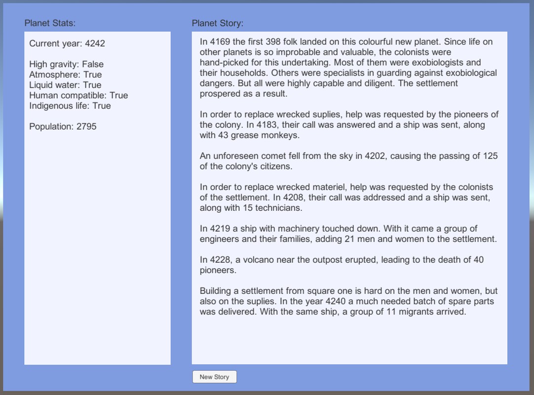
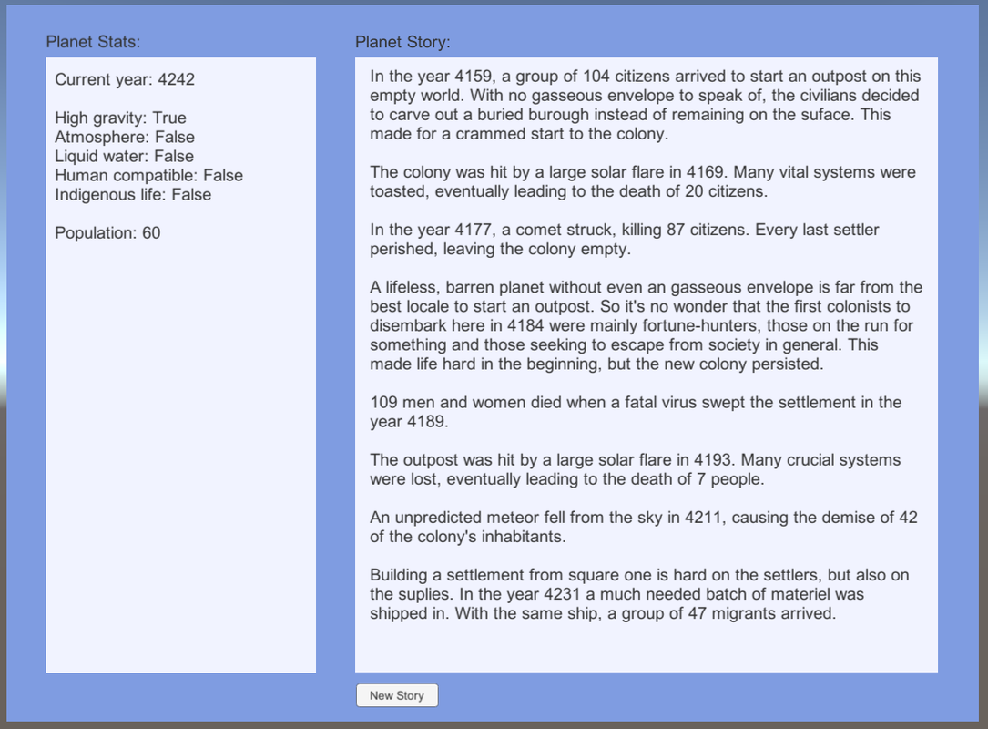
Also note that if the population of the colony goes to zero, it will (have to) start over.
There's a ton more stuff I'll add to this in the future. To create more interesting stories and also to generate more variables that will eventually have relevance in the game. I think it's cool to have a backstory for a colony that explains, or at least supports, the game play elements associated with the planet.
However, since the Key, Shovel Treasure release is only a little more than a week away, on November 9th, that will get most of my gamedev attention in the near future. So I expect my next blog post will be all about KST. After that, I'll certainly be back to tell more about these background stories and other new stuff we're doing.
- Willem -


 RSS Feed