Last week, I wrote that Key, Shovel Treasure (KST) was nearly done visually. I also edited the post, since I quickly found out I was wrong. After adding the new background and the game field border, I realised there were more tweaks to be made. I'm not brave enough to claim that KST is now really nearing its final form, so I'll just run you through the changes I made.
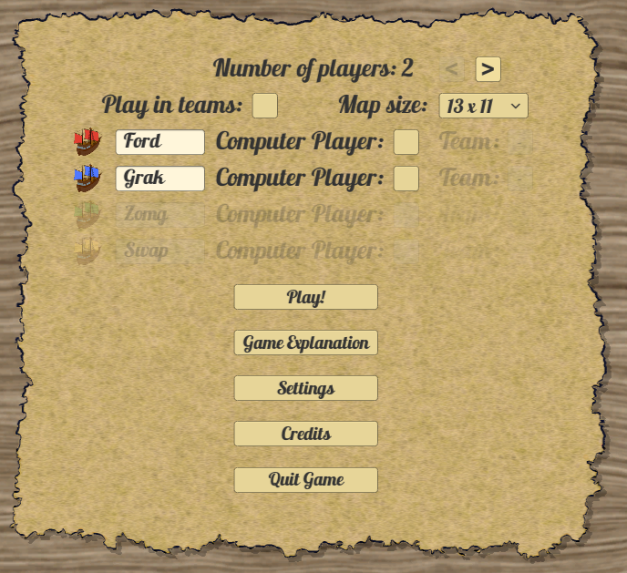
First off, fonts. All of KST was still in Arial, the standard font in Unity. I'm pretty much immune to which font is used as long as it's used consistently, but I do know that there's a whole world of subtleties out there which can make text connect from your game if applied well. I eventually went for a font with a balance between readability and pirateyness (which shall henceforth be an actual word). It's called Lobster and looks like this in the main menu:
First off, fonts. All of KST was still in Arial, the standard font in Unity. I'm pretty much immune to which font is used as long as it's used consistently, but I do know that there's a whole world of subtleties out there which can make text connect from your game if applied well. I eventually went for a font with a balance between readability and pirateyness (which shall henceforth be an actual word). It's called Lobster and looks like this in the main menu:
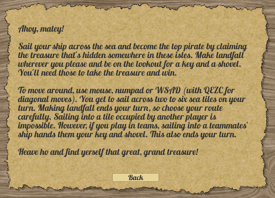
I'm pretty happy with the way it looks here. As a side note, I also slightly changed the background colour for the text input fields from white to off-white. This makes the input fields more connected to the rest of the menu. Anyway, back to fonts. Lobster works fine here, in the game scene and in the settings menu. The one place where I'm still doubting I should stick to this is in the explanation. Looks nice, but reads a tad difficult. For the moment I'm sticking to it :).
I also re-wrote the text for the explanation. It's much shorter now and should be easier to understand. When writing an explanation, I tend to write out the rules too much. Writing down the game rules exactly is a necessity in board games, but there's no need to do so in a video game. The computer restricts what you can do and you'll learn quickly enough just by trying. One could even argue that there's no need for a written explanation in a simple game like KST, but I'm rooted in board game design too much to let it go just yet :).
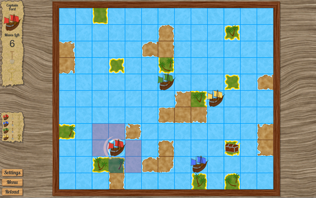
Another change is shadows behind the UI elements. They're visible in the menu screenshots, but they're easier to see in the game scene:
Another change is shadows behind the UI elements. They're visible in the menu screenshots, but they're easier to see in the game scene:
the strange thing with these shadows is that they're illogical (I think), since a flat piece of parchment on a table doesn't have a visible shadow and there is no reason the parchment should be floating above the table. And yet it does work visually. The shadows anchor the UI elements to the background and make the full picture easier on the eyes. This disconnect between logic and looks bugs me, but not enough to abandon what works visually.
I also gave the three buttons in the bottom left a wood texture. Unlike the buttons on the parchment, these are placed on the table and need a bit of an object-like look to them to make them fit in with the rest of the game. Small pieces of parchment wouldn't work as well, since the buttons should look distinct from UI elements that can't be clicked.
Other than that, I've made a couple of quality-of-life improvements like no longer having the possibility to access a land tile which holds nothing of interest (to prevent ending your turn by accident because of a misclick or typo).
Lastly, in mostly unrelated news, we made a new cardboard version of KST (with 'we' being my son (6), my daughter (4), my wife (I'm not stupid enough to mention her age) and me (39)). My son's class in school decided to hold a market to raise money for the island of Sint Maarten, which was devastated by hurricane Irma. During the market, my son offered people the chance to play KST with him for a small fee. He managed to explain and lead the game without any help, which I really see as an accomplishment for him. He raised 7,50 Euros this way and told me that the parents and classmates who had played with him had really enjoyed themselves. Needless to say, I'm a very proud parent :).
And that was that for now. Next up for KST are music, sound effects and decisions about when and how to release it. More on those things next time!
- Willem -


 RSS Feed