A short blog post about Key, Shovel, Treasure this week. There's not a lot of new stuff I can show, both because I've been busy with other things and because part of what I've been doing is behind the scenes stuff. But the big thing is that in my opinion KST has reached the point of acceptability. I mean that in the sense that I'm happy with the way it looks and plays and with the functionality. There are certainly more tweaks to be made, but I think the version we'll release will look a lot like the current version.
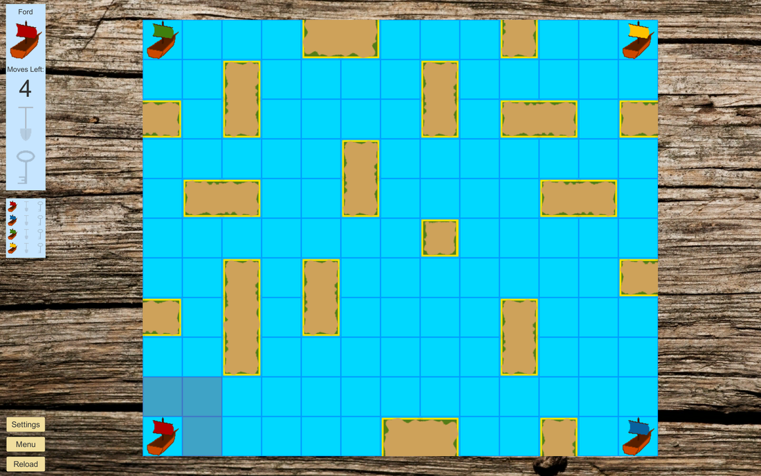
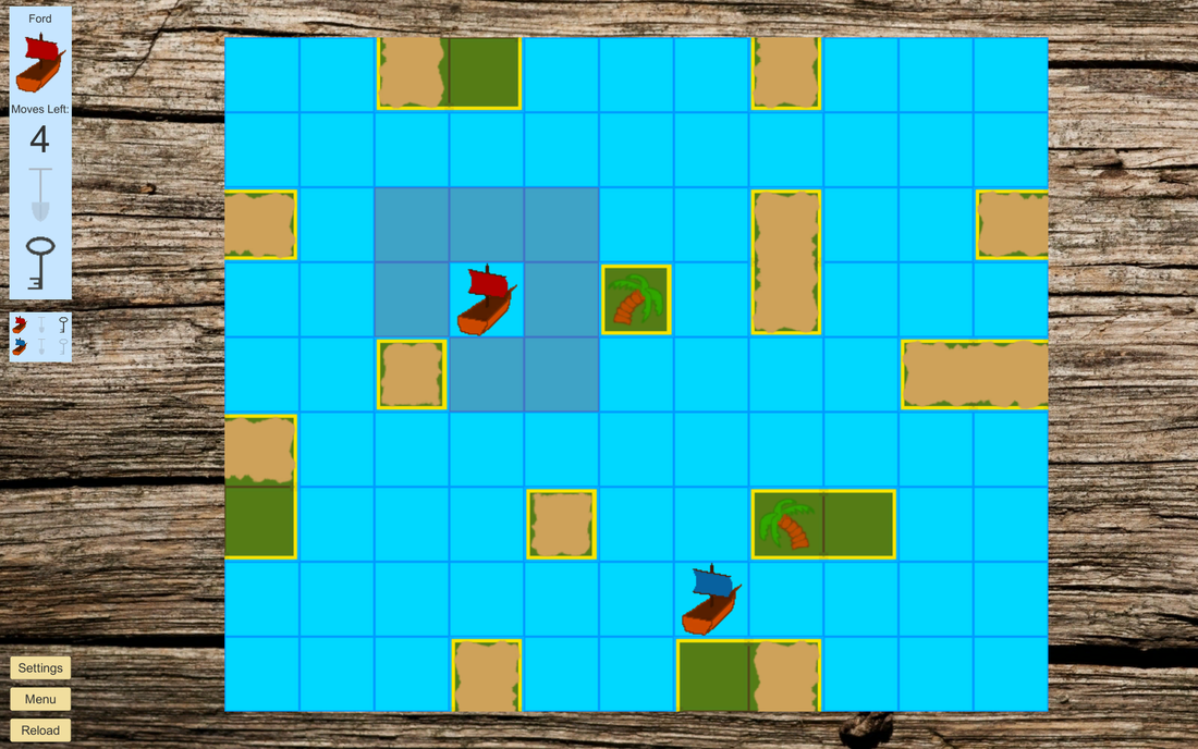
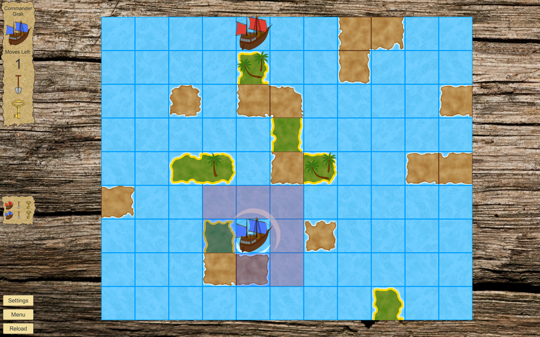
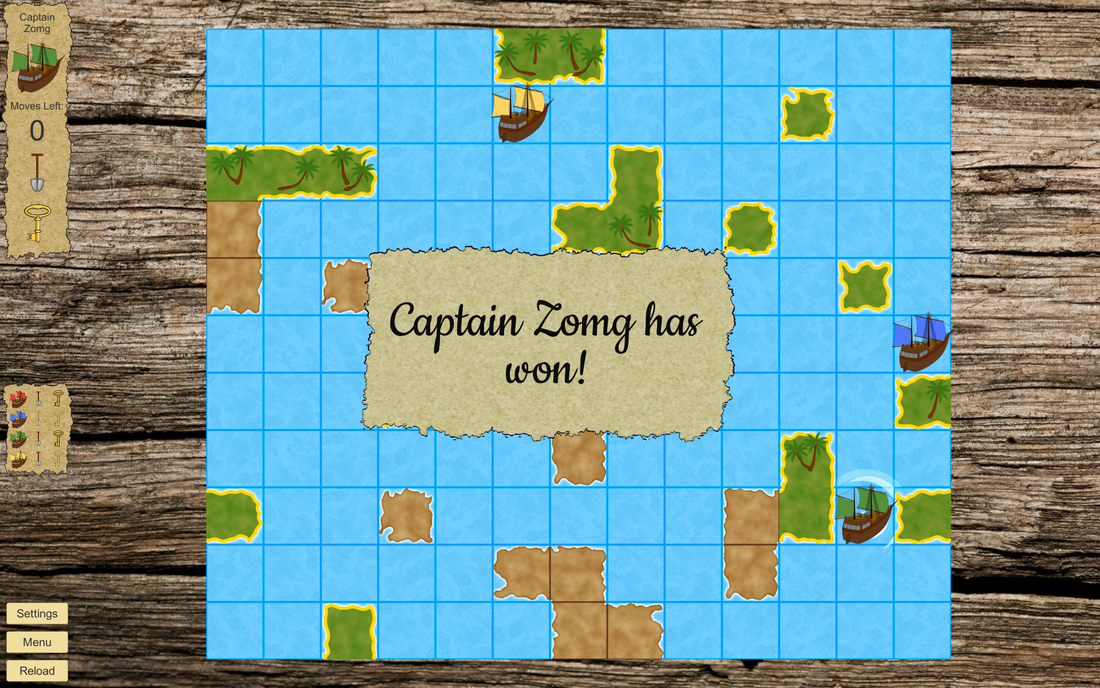
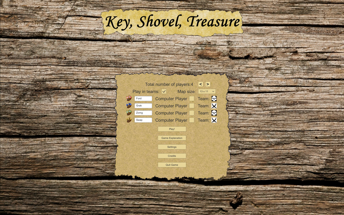
Which makes this a nice moment to look back at the visual changes since we decided that we wanted to release this to the world. So below are a couple of before and after pictures. I hope you can spot the differences ;).
Which makes this a nice moment to look back at the visual changes since we decided that we wanted to release this to the world. So below are a couple of before and after pictures. I hope you can spot the differences ;).


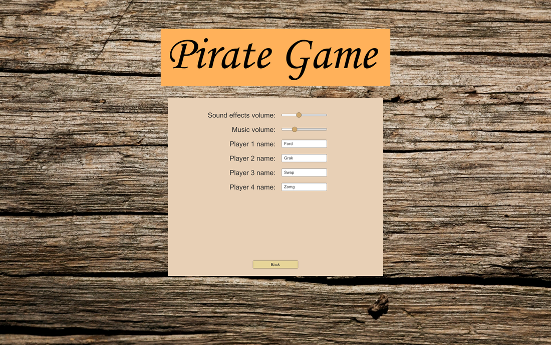
The only thing I'm somewhat worried about is that I might have become too attached to the way some things look. for instance, I really like the background as it is, but Michiel has commented that a more stylized version of a table top would work better. Experience tells me that there's a greater than even chance that he's right, but I keep finding other things to do than look for another background :P. So there actually is a good change that the look of the game will actually change quite a bit between now and release. For which we haven't set a date for by the way. We should probably start thinking about that.
- Willem -
- Willem -
Edit:
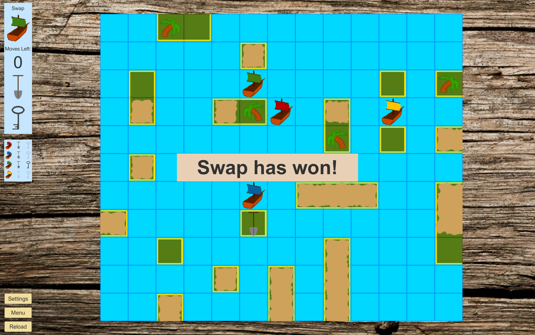
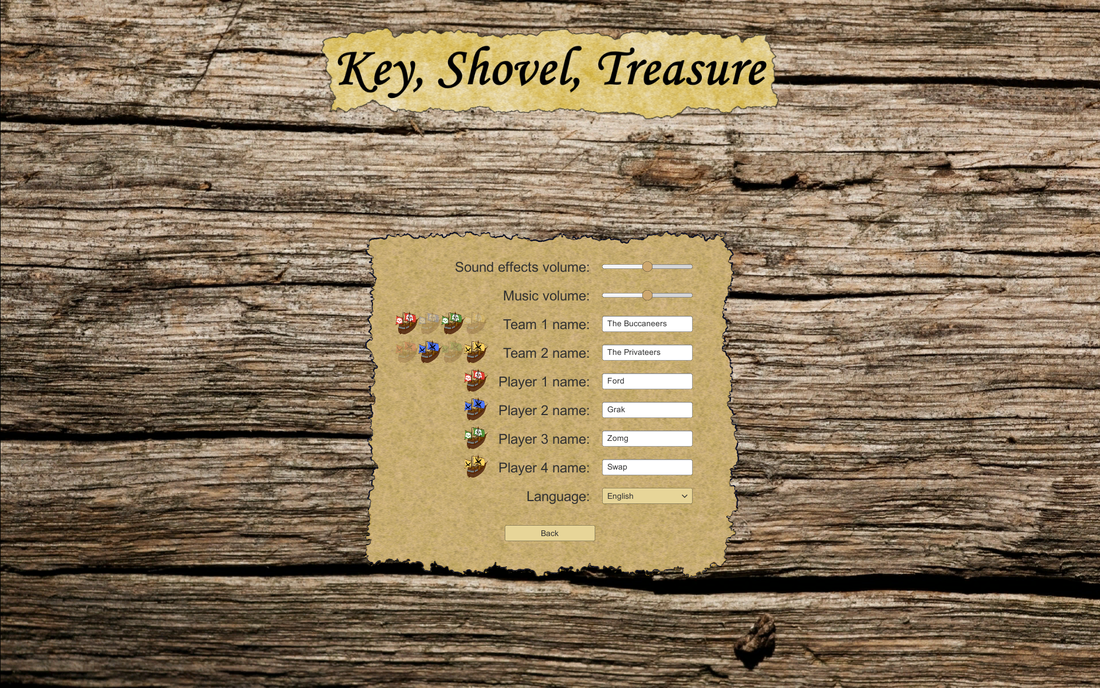
It seems that writing about avoiding changing the background helped change the way I look at it. And / or it get the creative juices flowing. Anyway, I set about creating a background. And while I was busy I also created a border for the game board, which was another thing Michiel already thought necessary. I still have to fidget with the colours, and perhaps I won't stick to this look, but this is what the game looks like now:
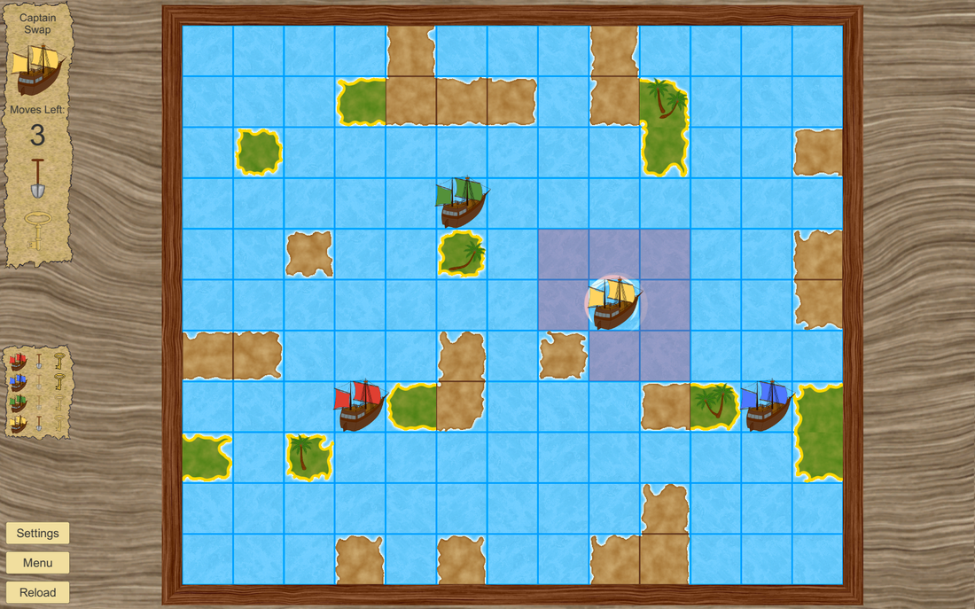
Different? Certainly. Better? I'm not sure yet, but I'm leaning towards yes. I certainly like that the background now more closely resembles the simpler-than-reality style of the rest of the graphics. Also, the border adds a nice bit of definition (and it hides the waves when they go outside the playfield).
Lastly, I'd like to give credit where credit is due. I found a great tutorial video by Jester of None, on how to create a wood grain texture in Paint.net. It's clear, short and the technique works like a charm. I recommend taking a look at his video if you ever use Paint.net.
Next time I'll let you know what Michiel thinks of this change (I haven't shown it to him yet; I only just finished this and he's at a concert) and whether we've decided to keep it :).
 RSS Feed